![팬톤 포뮬러 가이드 코팅, 비코팅 l GP1601B[PANTONE FORMULA GUIDE l Coated & Uncoated]](http://www.pantone.kr/web/product/medium/202211/4a7c973e9ca5908d5fb19fef3280e56b.jpg)


.jpg)
.jpg)
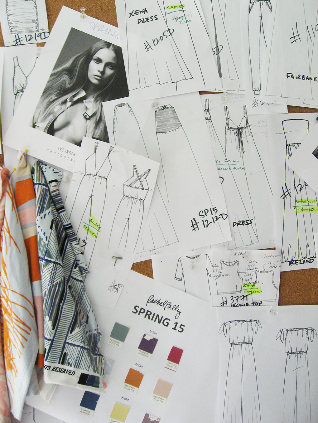
Prominent Colors
Pastels! From Bellini Orange and Ice Blue, to Pastel Pink and Chamomile Yellow – colors that are a little lighter and brighter.
Inspiration
The beauty of California in the spring, the golden hour at the end of a warm day, the Southwest as painted by Georgia O’Keeffe and the architecture of Frank Lloyd Wright.
Signature Colors
Orange – Bellini Orange is what we’ve called it. It’s the second color of the Chakra and is associated with happiness, confidence and resourcefulness.
Must-have Item For Spring 2015
Jumpsuits and rompers! We have a new crisscross back jumpsuit with a plunging neckline in our stencil print – which consists of Succulent Green, Dutch Blue and Ice Blue and Mesa Pink pastels – that I can’t wait to get my hands on.
How has the growing acceptance of seasonless color impacted or inspired your design and color choices?
We’ve always had a seasonless approach to color in our collections and don’t adhere to guidelines of only using certain colors at certain times. For example, our fall 2014 collection had rich Samba Reds and dark Hunter Greens, but also a Dusty Lotus Pink and a Cerulean-like Aquarius Blue throughout, which may not typically be thought of as ‘fall colors.’ Past and present we try to choose colors that feel fresh, look beautiful, and tell the story of that season.