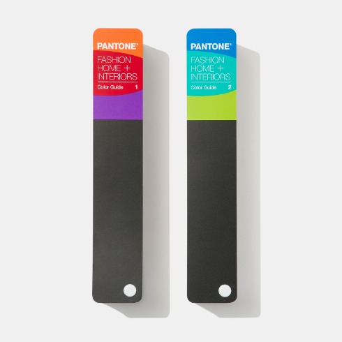
![팬톤 포뮬러 가이드 코팅, 비코팅 l GP1601B[PANTONE FORMULA GUIDE l Coated & Uncoated]](http://www.pantone.kr/web/product/medium/202211/4a7c973e9ca5908d5fb19fef3280e56b.jpg)


Lee Eiseman talks Fall 2015
Juxtaposition of color from opposite
sides of the spectrum emphasizes poise and confidence on the runway. The Fall
2015 palette is rooted in multi-faceted, androgynous colors that can be worn to
portray effortless sophistication across men’s and women’s fashion; it is the
first time we are seeing a truly unisex color palette.
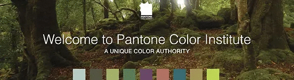
Leatrice Eiseman Executive Director, Pantone Color Institute®
This season displays an umbrella of accord that weaves earthy neutrals with a range of bold color statements and patterns to reflect a landscape of hope, fun, fantasy and all things natural. The colors are evocative of a love for nature and a timeless appreciation for warmth and security, which are conveyed through naturally inspired colors that remind us of things that are real and protective.
This Fall, designers’ pay homage to progressive moments in American history ? from the seductive ‘20s to the bohemian hippie and modernists of the ‘60s and ‘70s ? while stringing together an affection for colors and styling that are innately easy to wear by both men and women.
"Juxtaposition of color from opposite sides of the spectrum emphasizes poise and confidence on the runway,” said Leatrice Eiseman, executive director of the Pantone Color Institute. "The Fall 2015 palette is rooted in multi-faceted, androgynous colors that can be worn to portray effortless sophistication across men’s and women’s fashion; it is the first time we are seeing a truly unisex color palette."
WOMEN’S AND MEN’S PALETTES
There is one major distinction in the colors this season: A grand shift towards an evolving color palette that is not reliant on color distinctions typically assigned to each gender. This Fall, designers look to sartorial styling and fabrics to define both a masculine and feminine interpretation of hues and color combinations.
The importance of neutrals continues to evolve with Desert Sage, a cool and soothing greenish-gray that serves as the ideal neutral across the Fall 2015 palette. Timeless and unobtrusive, yet powerful enough to make a statement on its own, Desert Sage speaks to the feeling of naturally inspired colors that remind us of things that are real and not invented.
Reminiscent of the sky on a gray, overcast day, Stormy Weather is dependable, cool and above all, constant. Implying quality and luxury, it is a powerful blue-gray that is strong, protective and enduring. Just as the sun comes out after stormy weather to bring us cheer and a glimmer of hope, Oak Buff is a mellow, comforting and warming shade that brings good feelings. One of nature’s many illustrious shades, the golden-yellow Oak Buff acts to nurture and comfort. Combine Desert Sage, Stormy Weather and Oak Buff for a look inspired by the flora and fauna of Fall.
An olive green once thought of as strictly safari or military, Dried Herb is elevated this season to be sophisticated and chic. Closely related to nature, Dried Herb is an organic shade redolent of nature’s earthy fragrances. Interesting on its own and a wonderful contrast to other hues, Marsala is a winey red-brown that adds finesse and savoir faire to the palette. Rich and robust, Marsala incorporates the warmth and richness of a tastefully fulfilling meal, while its grounding red-brown roots point to a sophisticated, natural earthiness. A lush and elegant teal, Biscay Bay splashes up against more heated tones with its cool touch, combining the serene qualities of blue with the invigorating aspects of green. This cool and confident tone inspires thoughts of soothing tropical waters, transporting us to a place that is pleasant and inviting.
A nod to the ‘60s and ‘70s, Cadmium Orange evokes a sentiment of optimism, fun and fantasy. Both playful and sophisticated in its appeal, Cadmium Orange is a warm, welcoming and subtly dramatic hue that is striking enough to stand on its own or act as a bold contrast. A play on the ‘60s with a twist of today, luxurious Cashmere Rose is a tactile and soft pink hue that renders exactly what it promises. Cultivated in its richness, Cashmere Rose displays a gently persuasive and composed pink that is more upscale than downtown. Both men and women can weave Cadmium Orange and Cashmere Rose with Desert Sage for a bold mix of bright, earthy inspiration.
Thoughtful, contemplative and composed, Reflecting Pond is a cooling blue that adds dimension and intrigue to the Top 10. Conveying a message of credibility, Reflecting Pond is a serious shade that speaks to the need for stability and security. Indicative of our affection for color, Amethyst Orchid is the jewel in the crown of the Fall 2015 palette. Intriguing, vibrant and somewhat sensual, this enigmatic shade is an extraordinary hue that is unique, bold, creative and exciting.
In addition to traditional clothing and styling, Fall 2015 colors are an effortless fit for beauty. Layer Cadmium Orange, Cashmere Rose and Amethyst Orchid for an exotic eye shadow look, or Desert Sage and Oak Buff for a softer, more natural appearance. Add Dried Herb to nearly any combination for a bit more depth and interest. Biscay Bay provides a sprinkle of coolness to warm undertones or adds a harmonizing and subtle touch to neutrals such as Desert Sage and Dried Herb. Highlight natural tones with a soft and subtle splash of playful Cashmere Rose and introduce sophisticated Marsala for an appealing and enticing vibe.
For more than 20 years, Pantone, the global authority on color, has surveyed the designers of New York Fashion Week and beyond to bring you the season’s most important color trends. This report previews the most prominent hues for Fall 2015.
The top ten colors for men’s and women’s fashion for Fall 2015 are:
- PANTONE 18-4214 Stormy Weather
- PANTONE 16-1144 Oak Buff
- PANTONE 17-0627 Dried Herb
- PANTONE 18-1438 Marsala
- PANTONE 18-4726 Biscay Bay
- PANTONE 15-1340 Cadmium Orange
- PANTONE 16-2215 Cashmere Rose
- PANTONE 16-0110 Desert Sage
- PANTONE 19-4326 Reflecting Pond
- PANTONE 17-3628 Amethyst Orchid
Lee Eiseman talks Fall 2015


